A well-designed logo is a simple way to make a positive first impression, communicate what your business stands for and differentiate yourself from the competition. But what makes a good logo?
A logo is the primary identifier of your company. It's usually the first thing a potential customer notices about a business, whether they're holding a business card in their hand, or coming across it on their social media profile or website. The logo is an essential part of a company's brand identity and should feature prominently in all branding and marketing materials.
Logos fall into three broad categories. Each category has its own advantages, so it's important to understand the differences and think carefully about which one fits your profile.
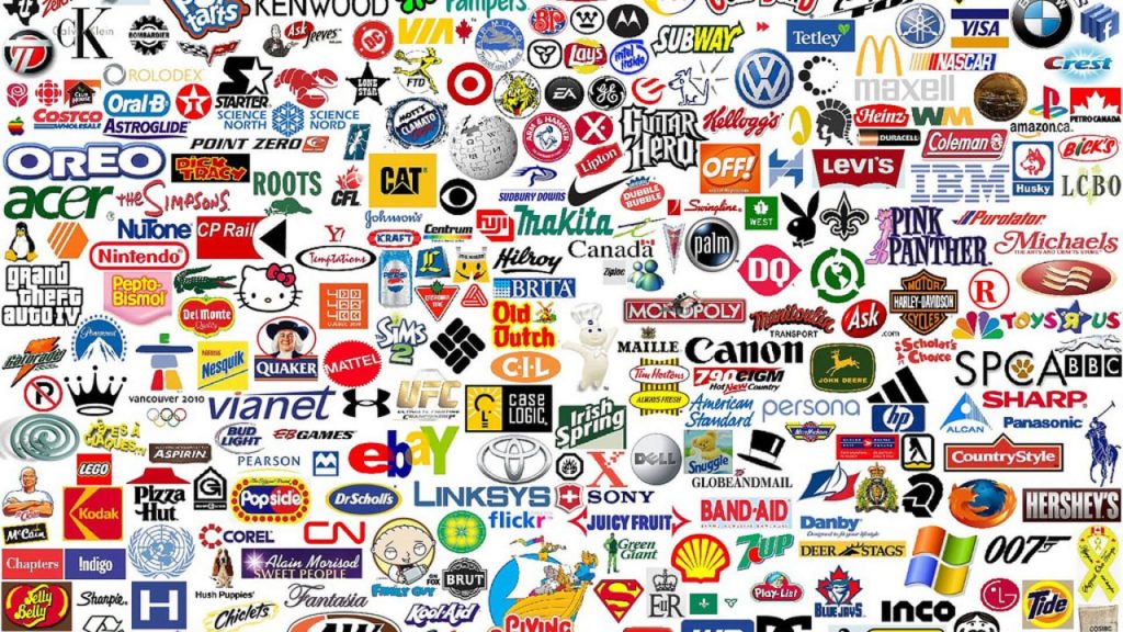
Image-based logos
Image-based logos use only one symbol to represent your business. These can be abstract images, such as those used by Airbnb, Pepsi and Microsoft.
There are literal images that have been simplified and stylised, such as the logos used by Apple, the old Twitter.
Image-based logos are simple, bold, and instantly evocative of the brand. However, they work best for large companies that have built brand recognition over time. Not the best choice for small businesses just starting out.
Text-based logos
Text-based logos use either the company name, like eBay or Coca-Cola's logo, or a monogram, like Coco Chanel's logo, or an initial, like the "W" used by WordPress.
A text-based logo using a company name is a good choice for a new business or a small business with a relatively short name to get people to know your brand. However, monograms and initials are not the best choice due to lack of brand awareness.
Combined logos
Combined logos, such as those of Dove, Mastercard (until recently) and Puma, contain both a symbol and text.
Combined logos are probably the most popular logos. Most companies that use symbols, monograms or initials combine them with text to describe the company name. This makes their logo easier to remember, especially if the company is new and the logo alone is not recognisable. Once a company's logo becomes widely known, the use of text becomes optional.
What is the secret of a good logo?
Simplicity
The best logos are simple, because a simple logo is easy to recognise and remember, and easy to scale up and down without compromising quality.
Relevance
The best logos use fonts, colours and symbols that reflect the image the brand wants to convey. A logo is relevant if it gives viewers an accurate picture of what the business is about.
Easy to remember
A logo is a business's introduction, so it needs to identify and differentiate itself from other businesses, capture the attention of potential customers and leave a positive and lasting impression. That's why the best logos are also very memorable.
Colours used wisely
Colours catch the eye, evoke emotions and convey messages. So you need to think carefully about what you want to communicate with the colours you use in your logos. Luxury and quality? Professionalism and reliability? Femininity and tenderness? You need to set the direction right from the start. It also helps to define your target audience.
Being trendy? Forget it!
A good logo is classic rather than trendy. It needs to be timeless, it shouldn't change year on year, even radically, as that will only confuse customers/customers. I always say: fashion comes and goes, style is eternal.
Versatility
Logos need to retain their quality whether they are used in print or online, whether they are reduced or enlarged, so the best logos work in all contexts. Whether you see them on a billboard or on a pen.